
/01.5 · Web Design & Development
Mobile-First Design
A flawless experience at your fingertips.
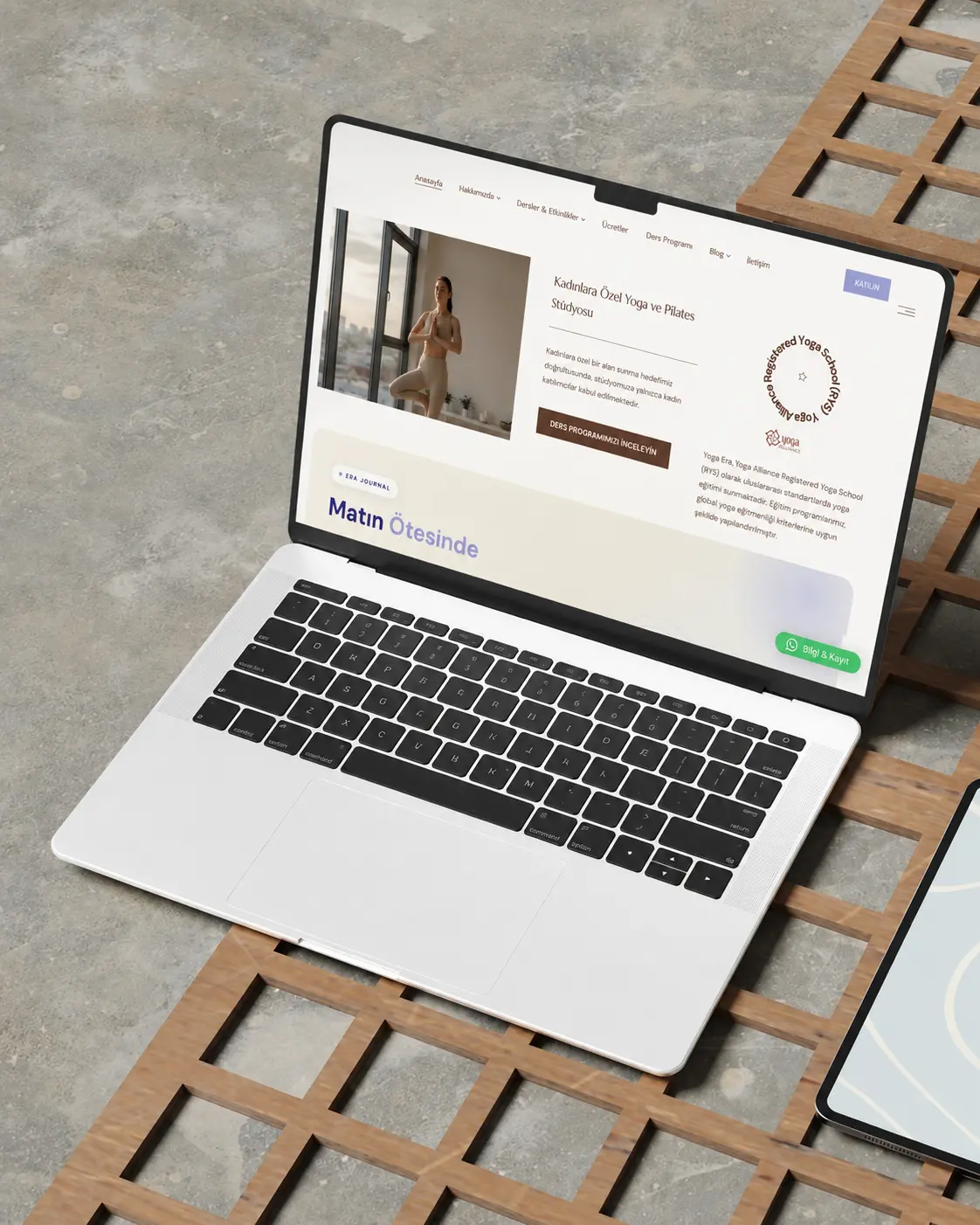
Most of your visitors meet you on their phone. We build touch-friendly interfaces that flow on every screen size.
Phone first, everything else after
We start designing on the smallest screen. Content gets leaner, buttons sit within thumb reach, touch targets are at least 44 pixels and pages load faster.
Fast in Google’s eyes too
Google indexes and ranks your site by its mobile version. We aim to stay under these thresholds in real-user data:
- LCP (largest content load): 2.5 seconds
- INP (interaction response): 200 milliseconds
- CLS (layout shift): 0.1
How we make it fast
We convert images to WebP and AVIF, serve the right size for each screen and lazy-load where useful. Fonts are self-hosted, unused code is removed, and caching plus a CDN deliver pages from the closest location.
Websites that feel like apps
Where it helps, we build the site as a PWA: it can be added to the home screen, opens on weak connections and offers an app experience without an app store.
Related solutions
Pairs well with
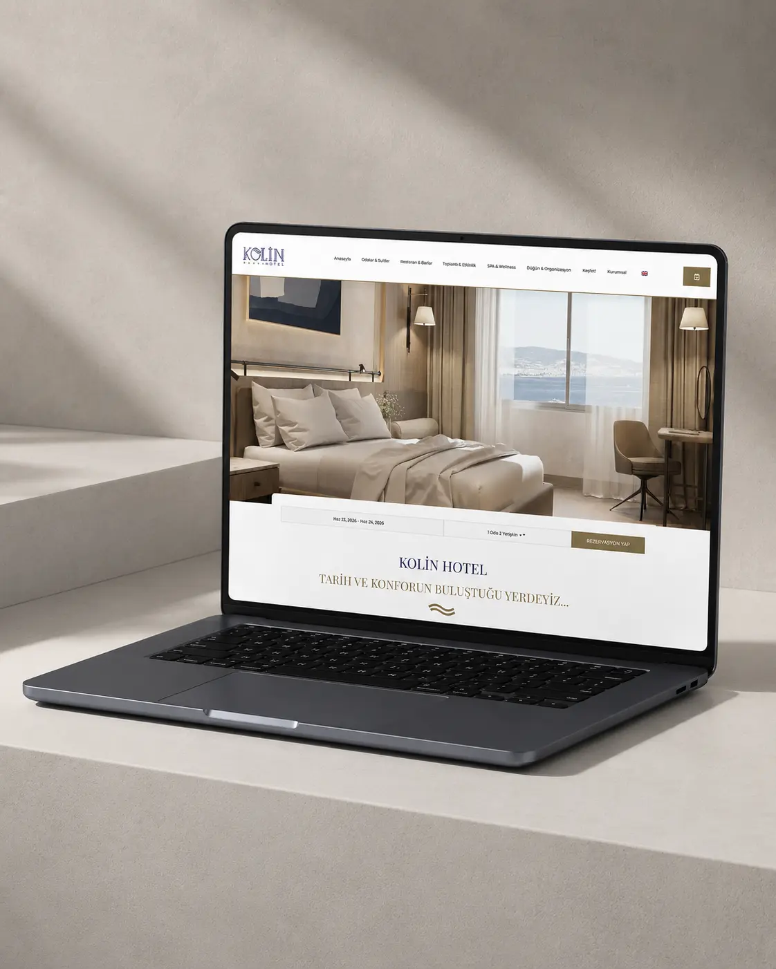 /01.1
Corporate Websites
We approach your corporate website not as an information page, but as a space where your brand comes…
/01.1
Corporate Websites
We approach your corporate website not as an information page, but as a space where your brand comes…
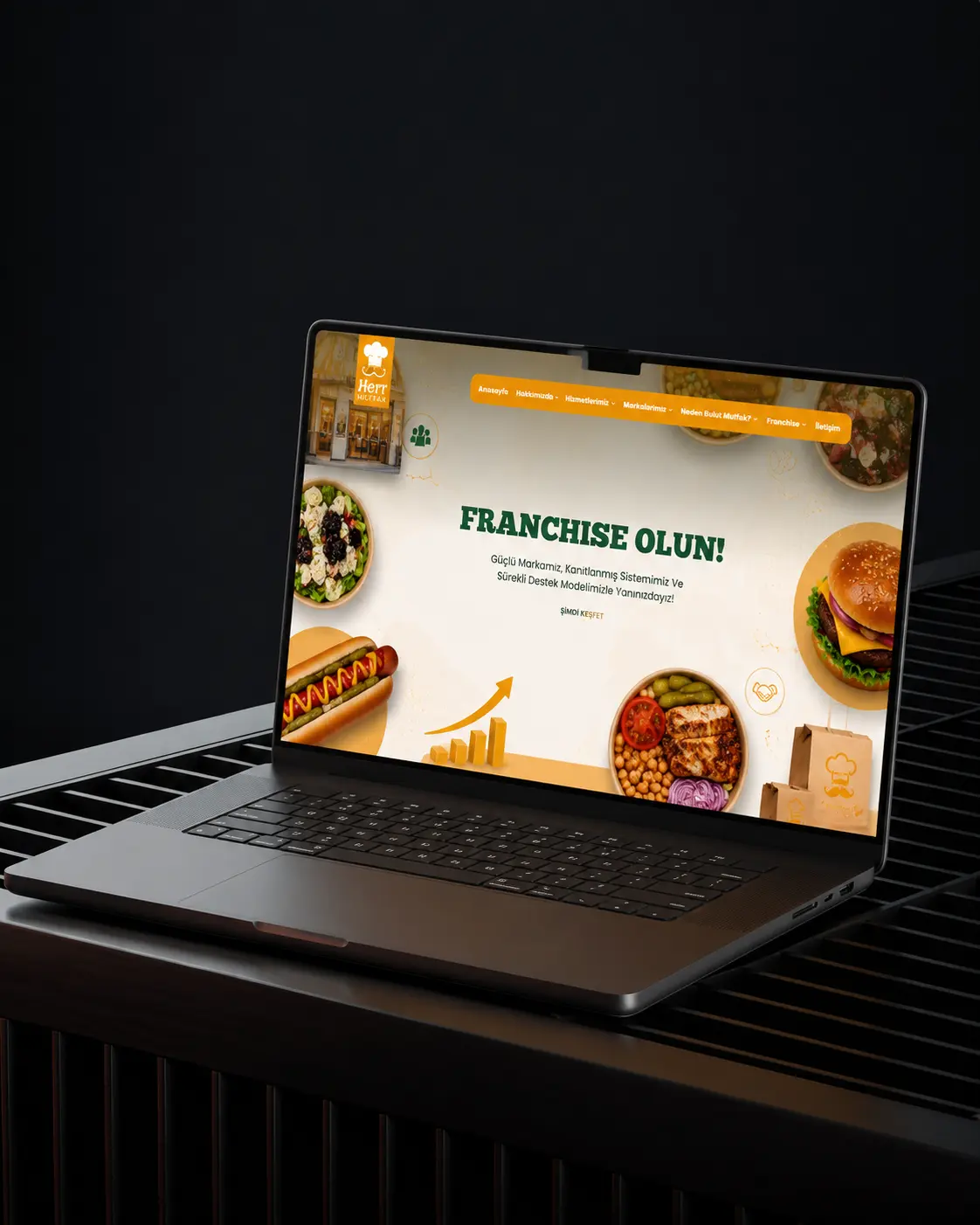 /01.2
E-Commerce
We don’t just display products — we design the entire buying journey, from discovery to payment.
/01.2
E-Commerce
We don’t just display products — we design the entire buying journey, from discovery to payment.
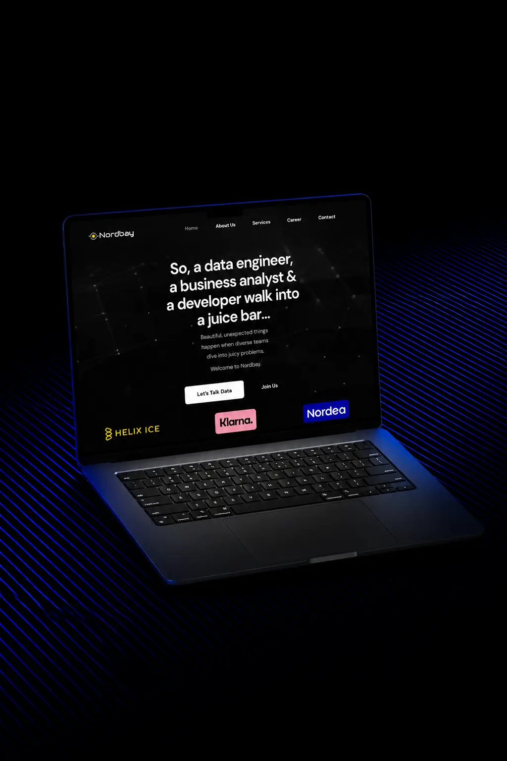 /01.3
UI/UX Design
We design not what users want to see, but how they want to experience it.
/01.3
UI/UX Design
We design not what users want to see, but how they want to experience it.
 /01.4
Landing Pages
We design single-goal pages that move visitors from interest to action within seconds.
/01.4
Landing Pages
We design single-goal pages that move visitors from interest to action within seconds.
Related Projects
Work we’ve shipped here
Frequently Asked Questions
Mobile-First Design
Can you make my current site mobile-friendly?
It depends on the stack; often a redesign is more efficient. We offer a free audit.
Why does mobile speed matter?
Google ranks by your mobile version; slow pages lose both rankings and sales.
What is a PWA and do I need one?
A PWA is a website that can be installed on the home screen and works like an app. It helps frequently used services and stores; we’ll assess whether you need one.
Which devices do you test on?
We test on current iPhone and Android phones, tablets and common desktop browsers.
The next story could be yours